- PRODUCT DESIGN
- UX
- UI
- UX RESEARCH
- USER TESTING
- INTERVIEWS
- PROTOTYPING
- DESIGN LEAD
- KYC FLOWS
- PRODUCT DESIGN
- UX
- UI
- UX RESEARCH
- USER TESTING
- INTERVIEWS
- PROTOTYPING
- DESIGN LEAD
- KYC FLOWS
Image: Klarna
PRODUCT DESIGN
KLARNA
FROM CARD
TO APP
First, launching the Klarna Card in three markets. Then, leading design for shopping in the Klarna app.
PART 1 · KLARNA CARD
ONE CARD, THREE MARKETS.
SMOOTH IN ALL OF THEM.
When I joined, the card’s launch in the US, UK and Germany was next on the roadmap.
Before launch, I tested every flow with real users, identified pain points and shaped the UX and UI from sign-up to first purchase, working closely with Klarna’s Global Marketing Manager.
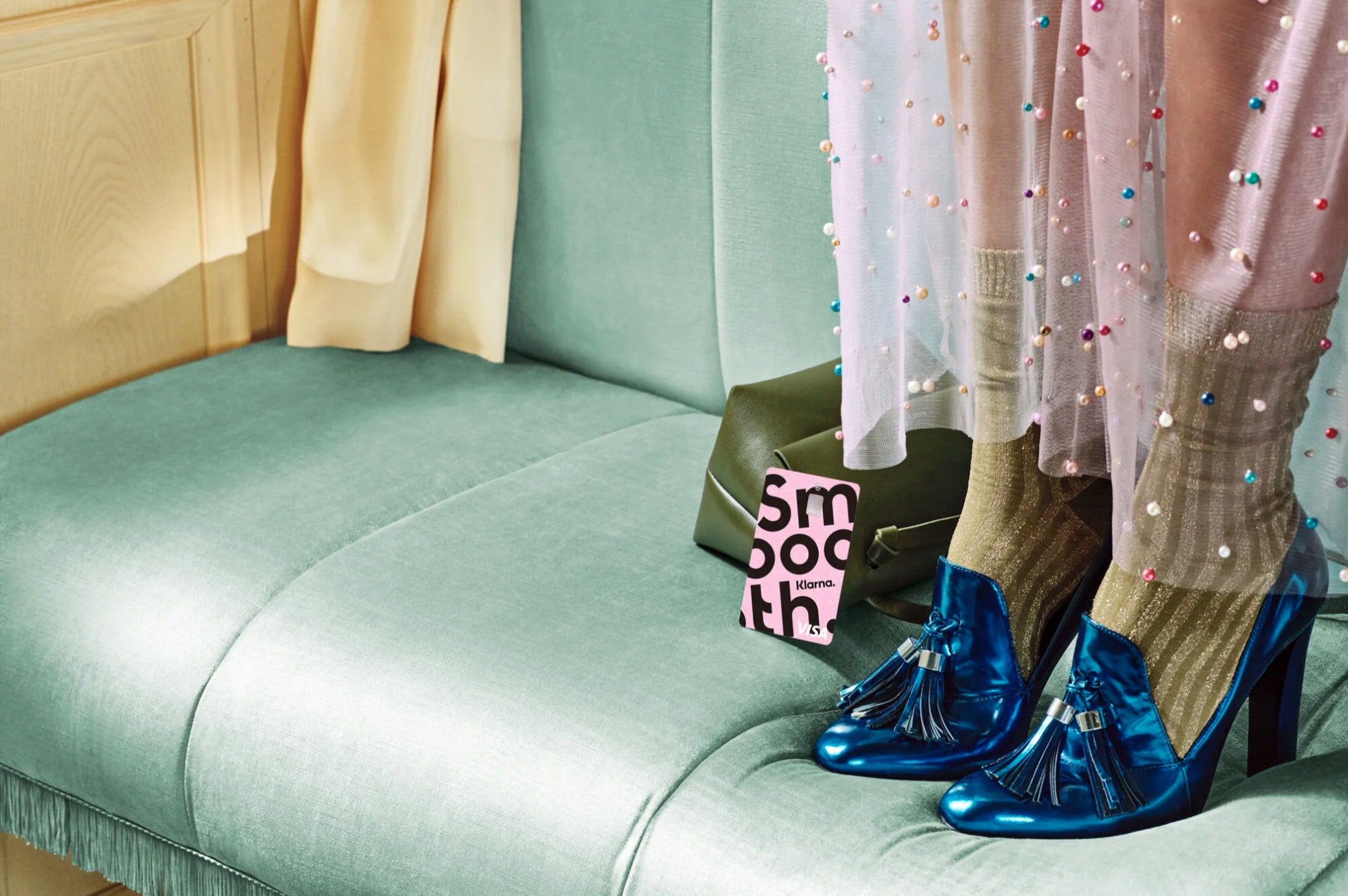
Image: Klarna
KLARNA CARD · SIGN-UP
PROVING
WHO YOU ARE
Much of the work was designing ID and know-your-customer (KYC) flows. Each market had its own rules, and some had smooth digital ID solutions while others didn’t.
I mapped every sign-up and identification flow, measured where people dropped off, and cut every step we could.
Then we tested, adjusted and tested again.
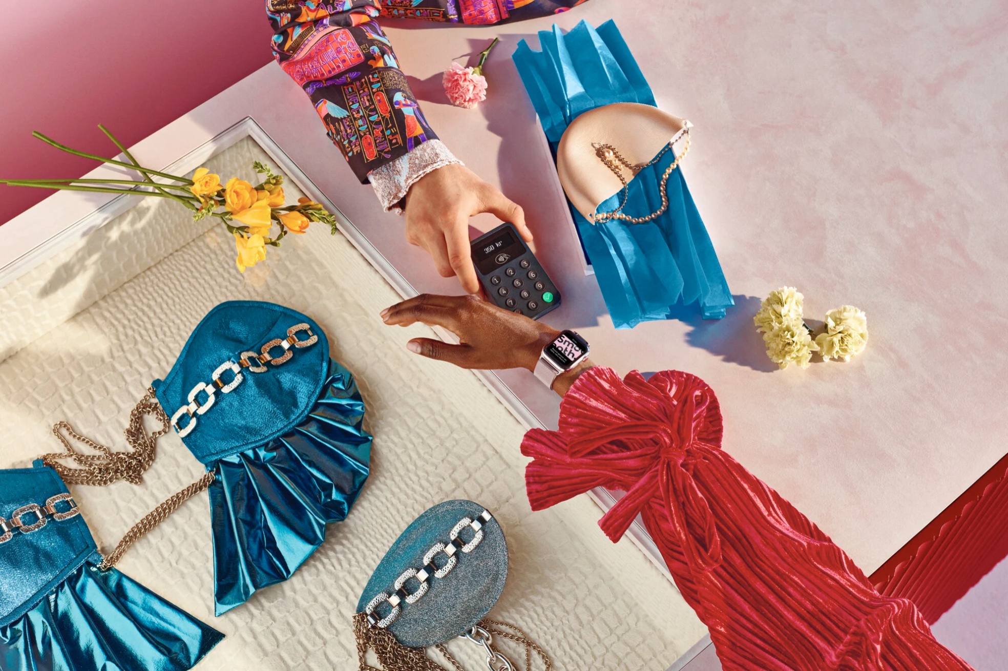
Image: Klarna
KLARNA CARD · PAYMENT MODEL
PAYING
ON PAYDAY
Americans plan around biweekly paychecks, not 30-day invoices.
Our team designed Pay in 4: installments every two weeks, sized to the purchase.
I tested it with US users in fake-purchase prototypes until the model held. It shipped.
KLARNA CARD · CARD DESIGN
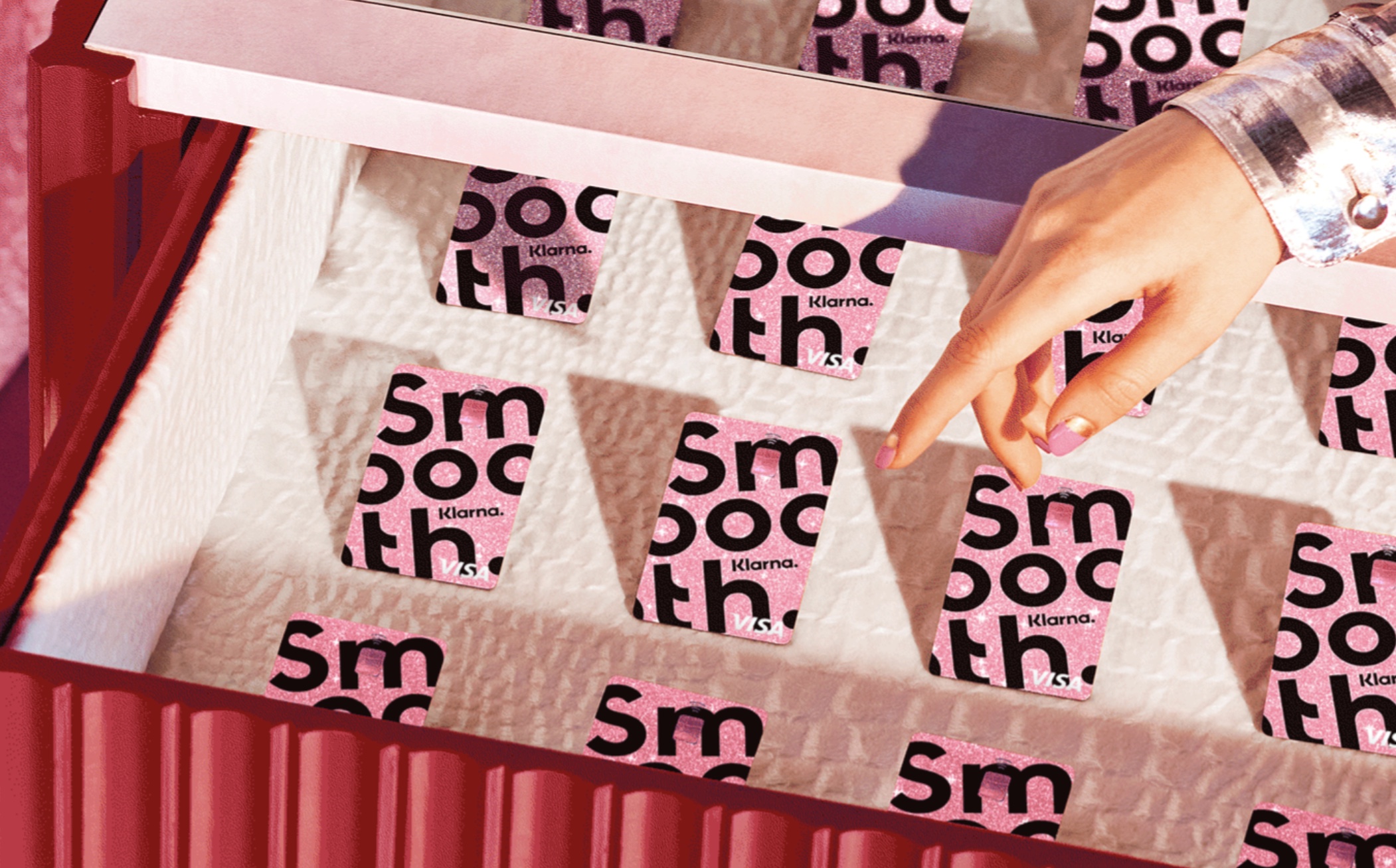
THE CARD NOBODY
UNDERSTOOD
Through extensive user testing and interviews, I found the problem: the Visa logo had been removed for a cleaner look, so people read it as a loyalty card.
I put the Visa mark back in my prototypes, and most testers understood right away.
Today’s Klarna Card carries the Visa logo.
KLARNA CARD · THE LAUNCH
FROM PROTOTYPE
TO SUPER BOWL
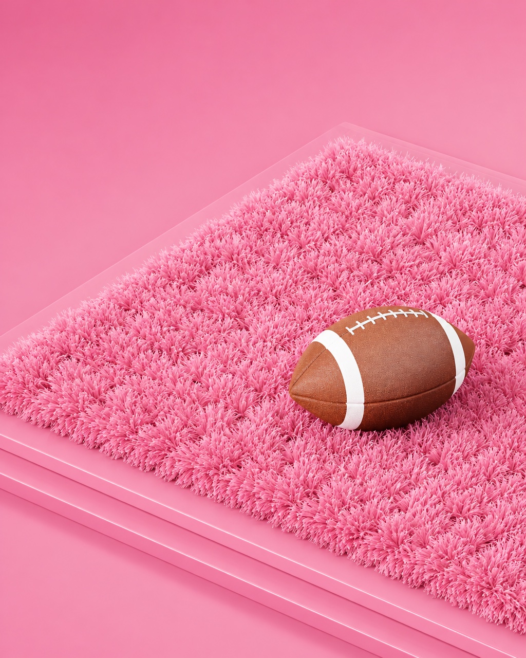
Pay in 4, the payment model our team developed and tested, starred in Klarna’s first Super Bowl ad in 2021. When the card opened, people were already waiting.
1M+
on the US waitlist before launch
~500K
UK sign-ups in the first three weeks
Figures from Klarna press releases, 2022.
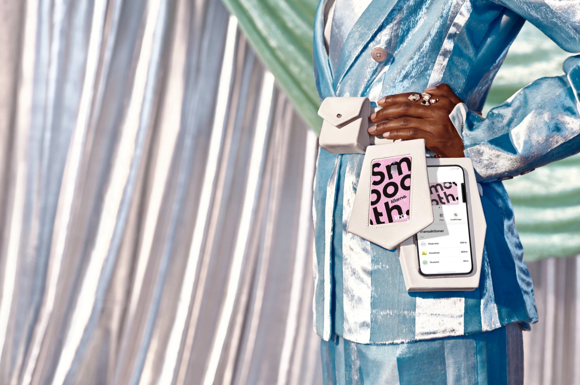
Image: Klarna
PART 2 · KLARNA APP · DESIGN LEAD
A PLACE
TO SHOP
Next, I led design for in-app purchases in the Klarna app.
Shoppers could browse any store inside the app, and pay with a one-time virtual card where Klarna wasn’t offered.
The challenge: getting people to shop there at all.
Image: Klarna
KLARNA APP · HOW I WORKED
AHEAD OF
THE ROADMAP
I was the responsible designer for Klarna’s in-app purchase team and all the teams under it, working with PMs and engineers, and supported designers across the app.
We designed concepts like wishlists, prototyped and tested them across markets, and let the results decide what to build.
MORE WORK